Menu Icon Indents

It's nice to see that Apple have learned that covering menus with icons is bad UI, as written about by various people when they messed it up in Tahoe.
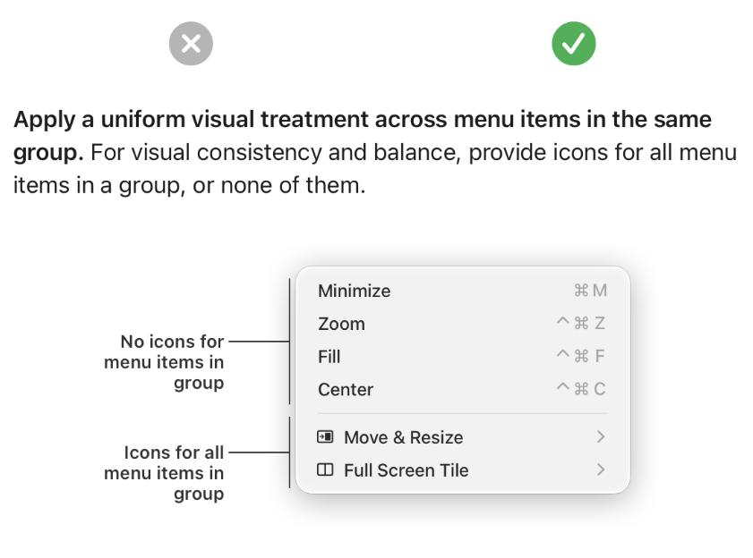
But this still isn't right. The header image is their new HIG example.
But those menu items with an icon shouldn't be indented. All the text should line up down the whole menu so you scan down it, not move your eyes in and out as items do and don't have icons.
Maybe this is just a bad HIG example screenshot.